We are continuously exposed to advertising in our day to day lives, be it on television, in print, billboards or through our online screens. As per the study conducted by Media Dynamics, Inc. on media usage and ad exposure, we are exposed to, on an average, 360 ads per day* (excluding brand exposures) but only 3 percent of these successfully make impression on our mind. This means only twelve ads a day actually engage and attract us. Nowadays, social media plays significant as well as influential role in comparison to traditional mediums. But sometimes, a perfect combination of pictorial and literary depiction can be just as effective as the shiniest, most high-tech digital onslaught presented by advertisers. With the right plan of action, print marketing can actually attract even greater audience than digital platforms. In fact, 92 percent of shoppers say they mostly prefer print marketing when making a purchasing decision.
Print media indeed is the oldest form of advertising that has very long history. The advertising plan started long back in 1468 during the times of William Caxton when he encourages a book that had his first printed advertisement.
To gauge the impact print ads can deliver, let’s discuss about some creatively brilliant ads which successfully managed to draw attention of audience with its firm concept, topped-up with great design.

Brands do advertise by ‘creating a sense of taste and aroma’ through print ads. Fruits have very recognizable aroma that gives a feeling of refreshment. A tea brand Curtis takes advantage of the sensation of smell and taste that can be aroused by looking at a piece of fruit.

Also to talk about how brands can grab the attention of audience by ‘connecting the tagline with the image’, Jack Daniel’s ad would be a perfect example. A little honey attracts the cluster of bees while a little JD attracts a crowd of people. Correspondingly, the tagline “Draws a Crowd” for Jack Daniel’s Tennessee Honey is bang on the mark and visually represented by a bottle swarmed with people.

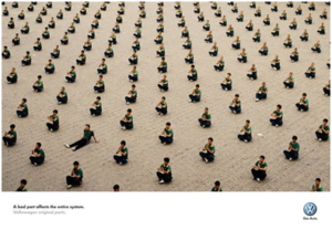
‘Breaking the pattern’ is another technique to make one’s ad stand out from the others. Our eyes rapidly become habitual to looking at patterns, so when you break that pattern, the disordered element stands out like a sore thumb. Indeed, this is the simple, creative and effective concept behind Volkswagen’s ad campaign, “A bad part affects the entire system.”

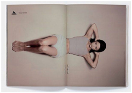
Lastly, one can also utilize the fold between the print mediums like newspapers and magazines to bring out the best of an ad presentation. The double page spread of Adidas: Forever Sports print ad would be the best example of this. They used the fold as the part of their design. The athlete crunches, lifts weights and stretches as we open and close the pages. A beautiful way to grab the sight of readers!


Can you notice that the taglines and images are intimately connected in nearly all of these print ads? It demonstrates the significance of starting any print ad or campaign with a strong and solid concept. So, to make a lasting impression, formulate the concept first and then transform it into representation, to create an ad that audience notices, remember, engage with and, most importantly, feel tempted to act on.
Roshani Singh || PGP-MR
roshani.singh@northpoiintindia.com
